Skip to content

Chromolithography and the mystery of Henri and Anita LeRoy

Chromolithography and the mystery of Henri and Anita LeRoy published on 58 Comments on Chromolithography and the mystery of Henri and Anita LeRoy

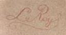
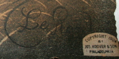
It all started with a print called “Spirited Horses”  diningroomwall
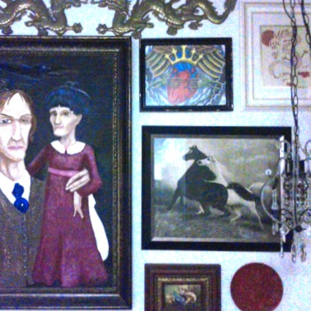
on my dining room wall.  I had inherited it from my grandmother.  I remember sleeplessly looking up at it on the wall of her den during ‘nap time.’  A notation on the bottom says it was copyright in 1900 by Jos. Hoover & Sons.  The signature reads ‘LeRoy’ with a circular flourish around it.

Then I saw the same picture in a magazine spread of an interior designer’s home and I was so captured by coincidence that I found out all I could on the artist and wrote a short post on my blog:  Vintage Prints and Small Worlds.

At that point in time, I found that the print was attributed to a Henri LeRoy (1851-), still life painter in France.  I have since found that the true artistry of Spirited Horses is much more convoluted.

A dealer on an auction site had a 1904 edition of Spirited Horses that lists it as a no. 2 in a series of images.  While researching his find, he found from a discussion list (no longer active) that Spirited Horses no. 2 was part of 4 companion images.  No. 4 in this series apparently shows the horses dead.  These images were attributed to Anita LeRoy, signing simply as LeRoy.  On yet another auction site, a dealer with a 1908 edition of Spirited Horses #2, spots it in the movie A Christmas Story in the scene where the leg lamp breaks.

I hate to say it, but all my researching didn’t turn up any definitive answer on whether Henri or Anita was the author Spirited Horses, or the many other prints that came out of Jos. Hoover & Sons printing with signatures like:

LeroySignatureLeroySignature2 leroysignature3
On the contrary, I wonder if there may be another answer and another artist for the prints out of Jos. Hoover & Sons, separate from Henri LeRoy (1851-) and Anita Pemberton (nee LeRoy).  The only person who may really know the answer is the printmaker himself:  Joseph Hoover.  The Philadelphia Print Shop Ltd., and the related Antique Prints Blog describe Joseph Hoover as the maker of elaborate wooden frames who later began producing prints under other publishers of the day including James F. Queen.   The Library Company of Philadelphia adds that Joseph Hoover, of Swiss-German heritage, was born in Baltimore in 1830 and became one of the most prolific chromolithographers of late 19th century parlor prints after he opened his own shop.  By 1893 his business was booming and he was working closely with his son, trained lithographer Henry Leander Hoover (b. Sept. 1866).

Continue reading Chromolithography and the mystery of Henri and Anita LeRoy

Color my house

Color my house published on No Comments on Color my house


Painting the exterior of the house is on our five year plan, along with getting a driveway (it’s true, we have none at all).  I have a habit verbally and gesturally describing my vision in a way that no one I know seems to understand, so I’ve taken to making mock-ups.

Eventually that green lawn-ish weed patch to the left of the side walk will be completely filled with mounds of flowering ground cover and low bushes.  That’ll help cover up the vent pipe too.

I love green. I’ve already painted my front screen door green, and there were some awesome green colors in 1950s exterior paint ads, but there are two other houses on the street (one directly across) that have taken advantage of green.  I suppose I’ll have to be content to have green walls on the inside of the house instead of the outside.

Schmidt House

Schmidt House published on No Comments on Schmidt House

color-palet

I was scoping out an online pallet generator and generally stewing over all the design recommends on picking colors for your whole house, so I made this.  My house has actually, and accidentally come together pretty well in my opinion.  Part inherited furniture (from family), part inherited room color (from the previous owner and/or original owner), and partially my natural leaning to red, green, and dark wood tones.

The only room not represented here is the music room; I don’t think it brings in too many more colors; it just has all of them in unbalanced abundance.

The ugliest spot in the house

The ugliest spot in the house published on 1 Comment on The ugliest spot in the house

DSCN0484
Every house has them: those rooms that need sprucing, the hole that needs patching.  Well, after we finally painted the pokey hallway, my kitchen became the ugliest spot in the house.  It’s visible from so many places in the house, it’s just too hard to ignore.

And it’s not that it was that horrible.  The no frills black cabinets and grey laminate counter tops are actually in really really good shape and better quality than I had in my last few apartments.  It took some time for me to warm up to it, but I no longer want to just rip everything out. I can deal with the counter being unlevel.

What was bad about it:  paint splatters around the sink and the melted butter yellow paint splotches on the blue-grey walls, holes in the drywall from an open shelf pantry we removed on the opposite wall, and a lot of dirty.  The paint splatters and most of the dirty just took a lot of cleaning, but the dirt smudges just wouldn’t budge off the mat finish blue grey paint.  I didn’t like the color anyway.

IMAG0146
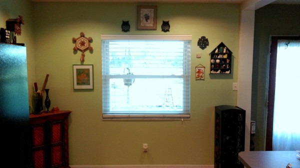
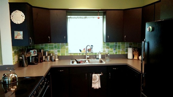
We also wanted to inject some midcentury style back into the 90s remodel.  In my dreams, this involves minty appliances, bold colors, and restoring the partial wall that was removed to make it ‘open concept.’  In my reality, we picked some retro feeling pattern for the backsplash ala kurtcyr’s pollen-euphorbia pattern on wallpaper at SpoonFlower.com.  Updating the cabinet pulls with sleeker, super simple options made a huge difference, and we painted.

The result is extreme.  The semi gloss we picked makes the room glow, though the effect is hard to capture on camera with all the windows throwing off the exposure.

IMAG0147
just waiting for a dinette set.

Eventually, we will build a kind of partition to shield the living room from the stove top, instead of allowing it to throw grease and vapors willy nilly onto upholstered furniture from it’s place in the middle of the peninsula.  I know this placement isn’t so clear in these pictures; I am dribbling out my before and after snaps so you only see how awesome it all is.  More will come later.

Hello Gorgeous!

Hello Gorgeous! published on 1 Comment on Hello Gorgeous!

DSCN0709 DSCN0710

We finally got the remaining furniture out of storage, and we finally got the two chairs that constituted much of the remaining storage back from the upholsterer.  This beauty here was the gold pressed vinyl arm chair next to the organ in my Grandmother’s house.  When it came to our apartment long ago, the cats loved it so much (that is, loved the pop their claws made in the vinyl) that we ended up calling it the sacrificial chair.

Now it’s back by the organ wearing my custom designed fabric.  This scarab and lotus pattern worked out so well I have made it available for others to enjoy on Spoonflower.  I think I will add some more seamless patterns after I give them another round of editing.  I paired the print with a pseudo suede solid for the bits that would get the most wear, and Walt’s Upholstery did a fabulous job of putting it all together.  He was a joy to work with!

Midcentury design

Midcentury design published on 3 Comments on Midcentury design

A rather boring, boxy remodel was committed on my kitchen, but other than that and most of the flooring, I have a lot of original materials in my house.  In fact, I have a lot of original materials outside of my house…like roof timbers, flue tiles and concrete partition blocks.  Every day I am more amazed at the fact that these things have hung around for 65 years.

concrete blocks

Before I met my house I had only ever come into contact with the standard two hole concrete block.  So when we started picking up rounded bullnose blocks and skinny partition blocks around the house, I was really intrigued.  I found them later in a Portland Cement Association pamphlet.  It was one of many pamphlets and catalogs for home building from the 40s and 50s, included in the Internet Archive’s Building Technology Heritage Library collection.  The collection’s also been pretty helpful in identifying the floor in the bedrooms (Armstrong 1949 pattern book) and the fixtures in the bathroom.  It’s kind of like backwards shopping, looking at old catalogs to find a match for what’s in front of you.

I dream of finding the floorplans for my house in one of the several house plan catalogs like Practical Homes.  I love how the post WWII housing boom was partially directed at the do-it-yourself home builder.  The Popular Mechanic’s famous Concrete Block House, an instruction manual to the home builder, includes a lot of techniques that I think were actually used in my home.

I wholeheartedly encourage you to peruse the Internet Archive’s Building Technology Heritage Library collection yourself.  It’s pretty spiffy, but a warning:  you may lose several hours of your day to it.

A small success

A small success published on No Comments on A small success
logfence
Creative Commons License
Log flower bed edging by LeEtta Schmidt is licensed under a Creative Commons Attribution-NonCommercial-ShareAlike 4.0 International License.

I imagine that landscape overhauls are becoming more popular for people that can afford them, but most people inherit their landscaping from the previous owners of their homes.  Older homes have years and years of decaying walkways and hidden bush and tree stumps that never get dug up or ground down when they are deemed expendable.  This is what our yards are like.

I started with dreams of hauling off debris and carving out perfect pathways with brand new pavers and fencing.  Then I sobered up.  Inherited yards are not blank canvases, and mine came with loads of history that would be too expensive to ignore.  For example, the fence surrounding the wide gate into the back yard was dry-stacked logs from trees felled by the previous owner.  It was cool and we kind of liked it, until it fell down.  Now it is a pile of work that laughs at us whenever we try to clean it up a little.  As much as I wish all the logs would just disappear, they are raw material, and free raw material at that.

Another obstacle is that old landscaping starts to fall in on itself, grass reaches across walkways, pavers settle inches higher or lower than their fellows, flowers compete with weeds in their beds.  The logs ended up being the perfect solution to put some designated areas back in my backyard.

Madagascar Periwinkle or Vinca Rosea grows like a weed in my yard and reminds me of my grandmother.  I noticed that the vinca in one corner of the yard weren’t suffering the sudden death of their fellows in the front or anywhere else.  Now, anytime I find a straggling vinca I move it here.  I planted my Mexican Petunia in the back and it is liking the location, too.  Incidentally, Mexican petunia is also a pest plant.  All non hybrid forms spread rampantly through prolific seed pods.  So you might say, I gave a corner of my yard to the weeds.

In Love with My House

In Love with My House published on 3 Comments on In Love with My House

015

Yes, we have purchased a house and moved.  It has sucked up every ounce of free time and money in a crazy tornado of excitement.  We are still managing a list of to-dos that is a little longer than we’d like (which is why you won’t see any other photos yet), but I think we’re winning.

One of the first things I did with any speck of free computing time was to search the history of my house and the surrounding neighborhood.  It’s both wonderful and a little creepy how many things you can find accessible as public information.  I have a good idea who originally owned my house.  It was built in 1949 and our county’s online records don’t go back that far, so I’ll need to do some real world research to complete the story.  I know who bought it next, and how long they lived there, and who after that.  I know the names of all my neighbors, the years that their houses were built, the crime patterns in and around our neighborhood, and how much every house last sold for.

Our house was built just before the zenith of mid-century design trends, but it has plenty of characteristics of mid-century houses, especially since it was expanded upon in the 60s.  Post WWII decorating is usually identified as being spare, thankful and very patriotic.  Red, white, and blue were often seen as color schemes.  There was a big trend towards outdoor living and incorporating those themes inside as well.  Our house has managed to hold on to bits of these ideas:  The pink and blue of the bathroom tiles with white commode, tub and sink have that late 40s patriotism.  It is ranch style, situated facing south and set wide on the lot so that windows and views of outside (especially the back yard) surround you when you are indoors.

The picture here is through a back window over the raised garden beds just off the porch.  You can tell we’re in Florida–even the weeds look pretty (for now) as our neighborhood embden geese look for a snack.

Yet, my house is not mid-century modern.  It has no transom windows, pine, or terrazzo floors.  It is, as The Mid-Century Modest Manifesto at Retro Renovation says, like the hundreds of other mid-century houses built for the average American family.  I like the mid-century modest idea, and I would like to retain the existing original components of my home and return as much of the updated areas to something more like what they were.  Retro Renovation is an excellent resource site.  Once I’ve got our bathroom more up to snuff I will show it off on Save the Pink Bathrooms.  I’ve also found Atomic Ranch magazine and Mid Century Home Style excellent help.

Vintage prints and small worlds

Vintage prints and small worlds published on 8 Comments on Vintage prints and small worlds

diningroomwall I inherited a strange little picture from my grandmother of two horses frightened by a storm, perhaps, or running towards some lightening.  I remember staring up at the horses’ pop eyes during nap time, and am terribly satisfied having it in my house.  This terrible cell phone picture is of my dining room wall, horse picture included.

It never crossed my mind to find out more about it, even though I had never seen its like anywhere else.  You can imagine my surprise when I saw it included in the gallery wall of interior designer Lauren Liess | Pure Style Home  while flipping through a home decorating magazine.  Liess’ style is much more polished and muted, but the horse picture has the same kind of punch, I think.  It is an oddity:  something banal enough to look past and yet odd enough to furrow the brow upon closer inspection.

Lauren Liess | Pure Style Home.

After a little searching I found that it is called Spirited Horses by Henri LeRoy (1851- ) a still life painter in France (*05/11/2015 now in question, see link to continuing research below).  LeRoy’s catalog, as far as I could find, revolved around prints of fruit and flowers with a few landscapes thrown in.  All of his pictures have the same feel:  a controlled and factual reproduction of the subject, but strange–like looking through a warped glass.  They are just a little bit naive.

I wanted to find out more about Henri LeRoy, but have been unsuccessful.  He, like several other Victorian chromolithograph artists, produced much in a new and flourishing world of consumer driven art.  Many chromolithographs were known for their publishers over their artists.  They found a champion in Harriet Beecher Stowe who lauded them as an asset to interior decoration (Rotskoff).  Perhaps because of Stowe’s support, and perhaps because a new and thriving middle class had grown from industrialism, consumption of these prints soared between 1840-1900.  They were so popular, as was using the technology for cards and advertisements, that the time period became known as the “chromo civilization” (according to Wikipedia).  Like any pop-art, they were not made to last and the numbers of undamaged prints out there have dwindled over the years, which is probably why I’ve only just seen Henri LeRoy’s Spirited Horses on anyone else’s wall.

05/11/2015:  A continuation of this research can be found in Chromolithography and the Mystery of Henri and Anita LeRoy

cited:  Lori E. Rotskoff (1997) Decorating the Dining-Room: Still-Life Chromolithographs and Domestic Ideology in Nineteenth-Century America. Journal of American Studies, Vol. 31, No. 1 (Apr., 1997), pp. 19-42


Primary Sidebar