Every house has them: those rooms that need sprucing, the hole that needs patching. Well, after we finally painted the pokey hallway, my kitchen became the ugliest spot in the house. It’s visible from so many places in the house, it’s just too hard to ignore.
And it’s not that it was that horrible. The no frills black cabinets and grey laminate counter tops are actually in really really good shape and better quality than I had in my last few apartments. It took some time for me to warm up to it, but I no longer want to just rip everything out. I can deal with the counter being unlevel.
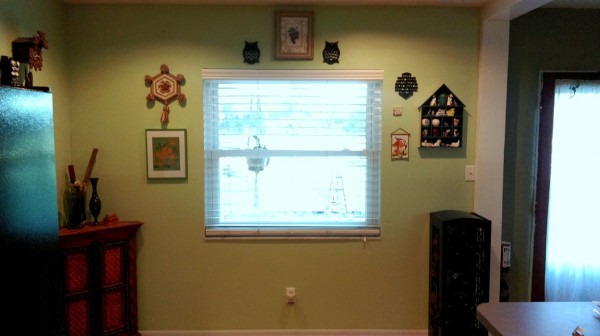
What was bad about it: paint splatters around the sink and the melted butter yellow paint splotches on the blue-grey walls, holes in the drywall from an open shelf pantry we removed on the opposite wall, and a lot of dirty. The paint splatters and most of the dirty just took a lot of cleaning, but the dirt smudges just wouldn’t budge off the mat finish blue grey paint. I didn’t like the color anyway.
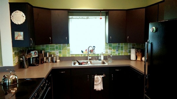
 We also wanted to inject some midcentury style back into the 90s remodel. In my dreams, this involves minty appliances, bold colors, and restoring the partial wall that was removed to make it ‘open concept.’ In my reality, we picked some retro feeling pattern for the backsplash ala kurtcyr’s pollen-euphorbia pattern on wallpaper at SpoonFlower.com. Updating the cabinet pulls with sleeker, super simple options made a huge difference, and we painted.
The result is extreme. The semi gloss we picked makes the room glow, though the effect is hard to capture on camera with all the windows throwing off the exposure.

Eventually, we will build a kind of partition to shield the living room from the stove top, instead of allowing it to throw grease and vapors willy nilly onto upholstered furniture from it’s place in the middle of the peninsula. I know this placement isn’t so clear in these pictures; I am dribbling out my before and after snaps so you only see how awesome it all is. More will come later.

1 Comment
That backsplash pattern is FANTASTIC!! So perfect for the midcentury vibe.