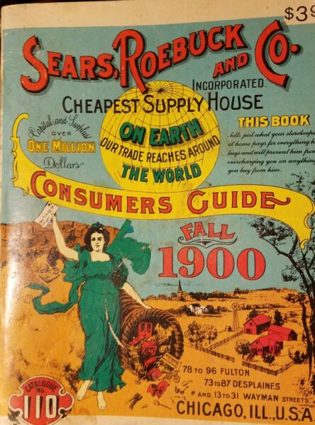
Do I need to introduce why I may have picked up a ‘mini’ sized reprinting of the fall 1900 Sears, Roebuck and Co. Consumers Guide, or why I am prone to acquiring similar aged magazines and catalogs? My inclination isn’t necessarily part of the nostalgic yet enlightened ‘vintage stye, not vintage values’ movement and argument (thought it is one I wholly support) as much as a type of historical voyeurism. I like to look at the pictures.
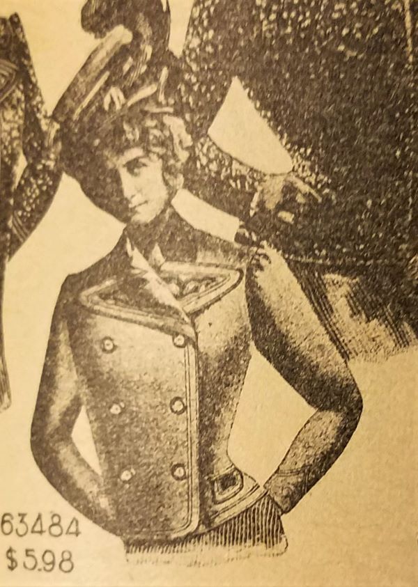
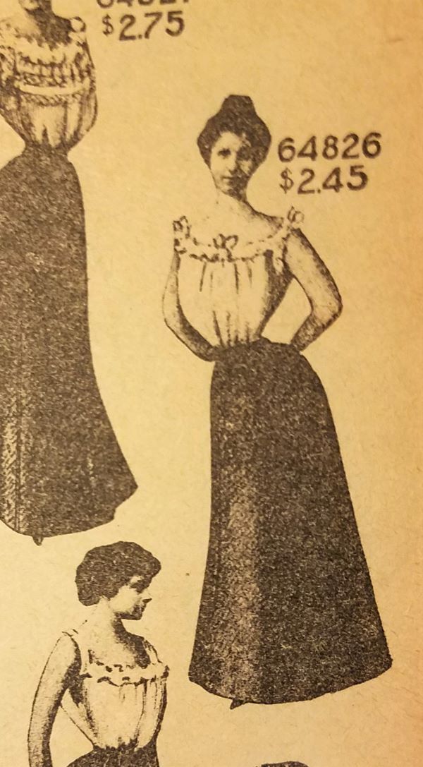
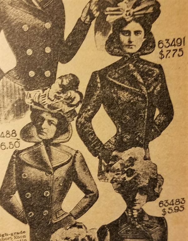
In any case. I was paging through this little catalog, wondering if I should get reader glasses because of the miniaturized print (the book is about 5×7 in), enjoying the product drawings, when I noticed that among the fabulously technically drawn shoes and chandeliers (a skill I remember from my earliest art education when graphic artists were still schooled in the ways of product drawings and sign painting), were photo-realistic fashion models…at least where their faces were concerned. What happened below their heads was some of the most ridiculous cut and paste manipulations I have seen.


I’ve looked at loads of 1900s post cards, cartoons, and fashion plates, so, at first, I wasn’t even paying attention to the exaggerated wasp wastes that connected pigeon breast and bustle. Clearly the ideal 1900s lady was a bird wolpertinger of the most terrifying! What first captured my disbelief were the coat collars, or specifically, how long a woman’s neck must have been to ensure her head showed up above the coat collar pictured. And then, the bird like illusion of woman was only more emphasized when her head cocked strangely to one side without affecting the length or rigidness of her neck and the collar that held it hostage!
I hope you enjoy the little ogle at absurdity as much as I did.
